Sports, Fitness & Wellness
·
Brussels, Belgium
Winner’s Club
A complete redesign of Winner’s Club’s digital experience, combining sports, fitness, kids programs, memberships and online booking in a modern Framer website built to simplify discovery and increase conversion.

RÔLE
Lead UX/UI Designer & Framer Developer
SCOPE
UX Audit · Information Architecture · UX/UI Design · Framer Development · Responsive Design · Conversion Optimization · Booking Integrations · Multilingual Experience · SEO Foundations
TOOLS
Figma · Framer · Sportigo · Weglot · Unsplash
Le challenge
CONTEXT
Winner’s Club is a long-established sports center in Brussels with nearly 3,000m² of facilities, including fitness, squash, climbing, group classes, kids activities, wellness and coaching. The existing website contained valuable information, but its structure had grown dense and fragmented over time, making it harder for visitors to understand the offer and reach the right booking flow.
CHALLENGE
The main challenge was to preserve the richness and family-oriented identity of Winner’s Club while dramatically simplifying the experience. The redesign also had to consolidate multiple audiences and use cases—adults, kids, free trials, memberships and squash bookings—while integrating existing Sportigo booking tools, supporting English and French, and creating a stronger foundation for paid acquisition.
Les objectifs
01
Simplify the user journey
Reduce cognitive load, clarify the information architecture and help visitors understand the club’s offer faster, with fewer navigation choices and more direct paths to the content that matters.
02
Increase booking intent
Turn the website into a conversion-focused platform by making free trials, memberships, kids registrations and squash court reservations visible and accessible throughout the experience.
03
Modernize the brand experience
Create a contemporary, premium and energetic interface that better reflects the scale, variety and atmosphere of Winner’s Club while remaining accessible to families, beginners and experienced athletes.
Le process
01 — DISCOVER
Audit & Strategy
Understanding the club before redesigning the interface
I audited the legacy website and the initial Framer build to identify content gaps, navigation friction and conversion opportunities. I mapped the club’s core audiences, high-intent actions and existing services before defining the new experience.
03 — DESIGN
UX/UI & Conversion
Making the experience feel as strong as the club itself
I designed a dark, modern and highly visual interface using strong sports imagery, clear hierarchy, immersive media and repeated conversion cues. Each page was structured around user intent rather than simply reproducing the legacy content.
Key UX Decisions
Quelques décisions qui ont directement influencé l’expérience finale.
01
Reduce an overloaded navigation
PROBLÈME
The former navigation exposed too many top-level choices, forcing visitors to understand the club’s internal organization before finding the right activity or action.
DÉCISION
I reduced and regrouped the architecture around clearer categories such as Programs, Prices and Contact, while keeping reservation actions visually distinct. This lowered cognitive load and made the site easier to scan on both desktop and mobile.
02
Bring booking into the core experience
PROBLÈME
Booking existed as a separate functional layer, creating friction between discovering an activity and taking action.
DÉCISION
I integrated the existing Sportigo flows directly into Framer for free trials and squash court reservations, then reinforced them with dedicated landing pages and contextual CTAs across the website.
03
Serve multiple audiences without duplicating the experience
PROBLÈME
Winner’s Club serves very different audiences—adult athletes, beginners, parents, children and squash players—each with different information and booking needs.
DÉCISION
I created reusable page patterns with tailored content, benefits, schedules and pricing while maintaining one coherent design system. Weglot was also integrated to provide a consistent English/French experience.
Direction visuelle
Energetic, Premium & Accessible
The visual direction combines a dark sports-led atmosphere with high-contrast typography, large imagery and immersive video. The interface feels energetic and premium without becoming intimidating, allowing Winner’s Club to speak equally well to performance-focused members, beginners and families.
Aa
Titres
Bold geometric sans-serif
Aa
Textes
Clean modern sans-serif
COULEURS
Noir, orange, accent jaune
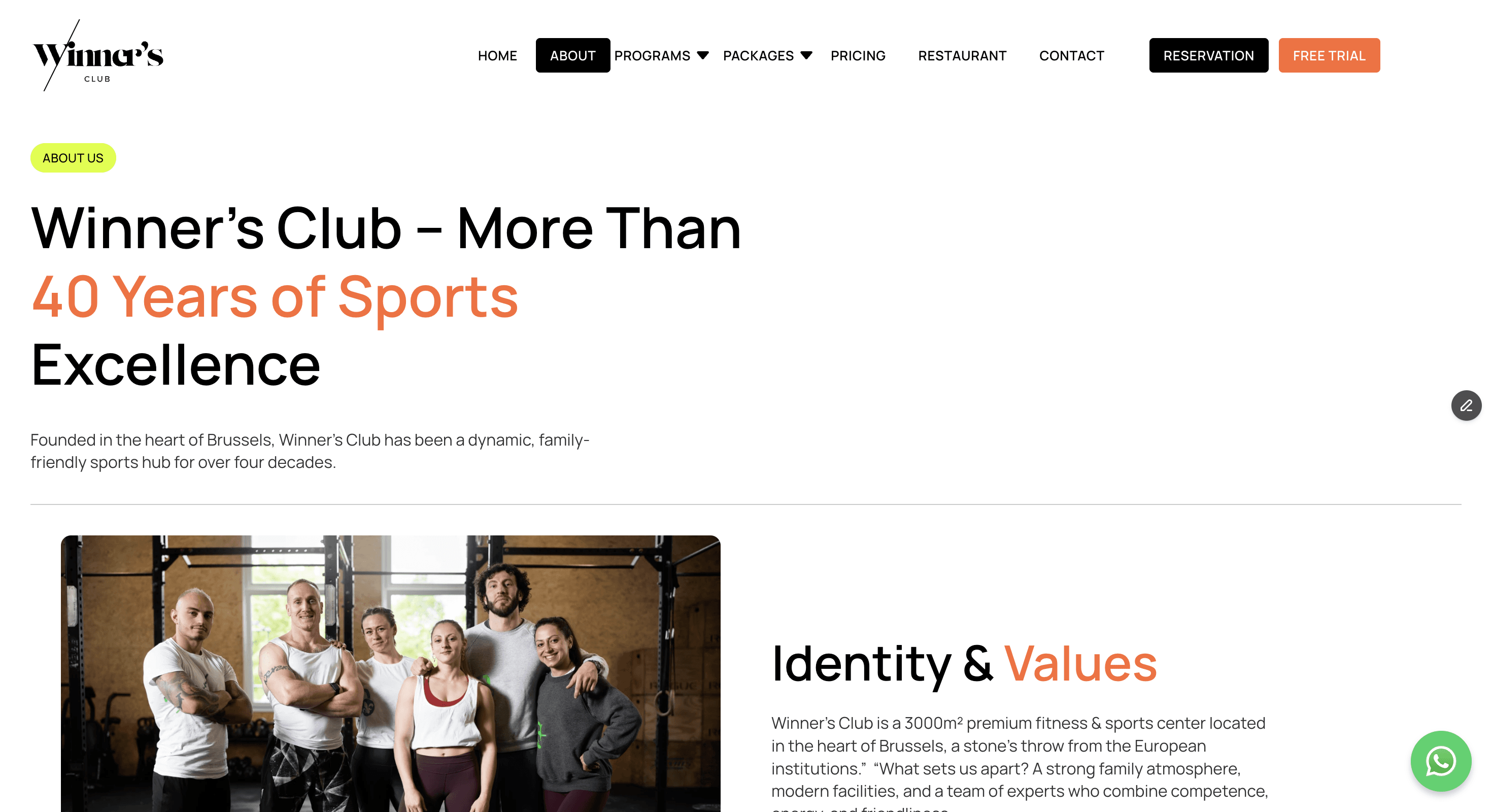
L'interface finale




Le résultat
The redesign transformed Winner’s Club from a content-heavy legacy website into a structured conversion platform. The new experience gives visitors clearer paths to programs, pricing and reservations, while integrating the club’s booking ecosystem and bilingual content directly into a modern Framer interface.
7 → 5
Simpler core architecture
The main navigation was reduced from seven primary destinations to a more focused structure, making the offer easier to understand and reducing unnecessary navigation choices.
24/7
Online booking access
Free-trial and squash booking flows are now directly accessible online through integrated Sportigo experiences, allowing visitors to move from discovery to reservation without leaving the website.
EN + FR
Bilingual experience
Weglot integration gives Winner’s Club a consistent English and French experience, making the website more accessible to Brussels’ international and local audiences.
A more coherent, scalable and conversion-oriented digital experience: clearer navigation, stronger presentation of the club’s 3,000m² offer, dedicated adult and kids program pages, integrated booking flows and a bilingual Framer foundation ready to support future acquisition campaigns.
